
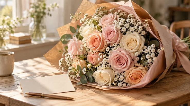
Which color says “I’m sorry” without sending the wrong message? Flowers often reach the recipient before any conversation does, and the colors in the vase set the first impression of the apology. Soft tones tend to read as sincere and humble, while bold, bright shades can feel celebratory or overly dramatic. Choosing the right palette for I’m sorry flowers depends on the relationship, the mistake, and the recipient’s own taste. Well-chosen colors make the apology feel considered instead of rushed, and poor choices can leave the recipient unsure of what the sender meant.
Color Sets the Apology Tone
Color is the first detail a recipient notices, often before reading the card. Those reactions are widely shared. People across 30 countries found it easy to link colors and emotions, and many of their answers matched closely. Pink was commonly linked to love and pleasure, while black was seen as the saddest color.
For I’m sorry flowers, this shared color language matters because the flowers speak before the sender does. Calm, gentle tones signal humility and care. Loud, saturated colors can suggest excitement or celebration, and that energy works against a message of regret.
Best Colors for I’m Sorry Flowers
Six colors appear most often in thoughtful apology arrangements, and they carry slightly different tones. The best choice depends on the recipient and the mistake.
1. White
White is the most versatile apology color. The shade signals sincerity, peace, and the wish for a fresh start, and it suits serious apologies where the sender wants to show humility. White roses, tulips, and orchids all carry this message well.
White also works for nearly any relationship, from a partner to a colleague. All-white arrangements can look formal, and adding soft greenery or a touch of blush keeps the design warm.
2. Soft Pink
Soft pink expresses gentleness, affection, and care without the intensity of red. The color fits apologies to partners, close friends, and family members. Popular blooms in this shade include:
- Blush roses
- Pink carnations
- Light pink tulips
- Pale peonies
Lighter pink reads as tender and humble. Deeper pink adds warmth and works best when the relationship is close.
3. Lavender and Purple
Lavender and purple carry the traditional meaning of regret and the wish for forgiveness. Purple hyacinth is the classic example, long associated with asking for pardon. Pale lavender feels softer and more approachable, while deep violet adds weight to a serious apology.
Color Insight
Purple draws the widest mix of emotional reactions across cultures. Pairing purple with white helps keep the apology message clear.
4. Blue
Blue reads as calm, peaceful, and steady. The color works well as an accent in an apology arrangement, especially after an argument where emotions ran high. Blue hydrangeas, delphinium, and blue hyacinth bring a quiet, soothing tone to white or lavender designs.
5. Soft Yellow
Yellow suits friendship apologies because the color is strongly tied to joy and warmth. Buttery or pale yellow flowers show that the sender values the friendship and hopes to restore it. Bright lemon tones can feel too cheerful for a heartfelt apology, and softer shades send a more measured message.
6. Peach and Cream
Peach and cream offer a gentle, neutral option for colleagues, clients, or newer relationships. These tones look warm and polished without carrying strong romantic or emotional meaning. Peach roses or cream ranunculus suit a professional apology that should feel sincere but reserved.
Colors to Use With Care
Some colors send mixed signals in an apology. Use these with care and only when the relationship or situation supports them:
- Bright red: Red carries both love and anger, and reactions to the color vary widely. Red roses suit a romantic apology between partners, but they can feel too intense after a serious hurt or for anyone outside a romantic relationship.
- Bold orange: Orange reads as lively and energetic. The color suits celebrations better than moments of regret.
- Bright yellow: Strong yellow can look too cheerful, and older flower traditions also linked yellow to jealousy. Soft yellow avoids both concerns.
- Very dark tones: Deep burgundy or near-black flowers can read as heavy or mournful. These shades suit sympathy designs more than apologies.
Bold colors are not always wrong, but they need a clear reason. Softer versions of the same hues usually carry the apology message more safely.
Colors by Relationship
The relationship decides which colors feel natural. Matching apology flower colors to the recipient keeps the message clear and appropriate. Partners and spouses respond well to soft pink and white, and red fits when the apology is romantic. Close friends receive soft yellow, pink, or peach as warm gestures without romantic meaning.
Parents and other family members appreciate white, lavender, and soft pink for their gentle, respectful tone. Colleagues and clients call for cream, white, or peach, since these shades look polished and keep the apology professional. Matching the color to the relationship avoids confusion about the sender’s intent. Romantic colors sent to a friend or coworker can feel out of place, even with a sincere note.
Colors by Apology Type
The size of the mistake also guides the palette. Lighter, brighter tones suit small slips, while deeper, quieter colors suit serious hurt. Common situations and their best color choices include:
- Small mistake: Soft yellow or peach
- Missed date or event: Warm pink
- Hurtful words: Lavender with white
- Broken trust: White with blue
- Workplace error: Cream or white
Matching the weight of the colors to the weight of the mistake keeps the apology in proportion. Overly dramatic colors for a small slip can feel excessive, while cheerful tones after a serious hurt can seem dismissive.
Shade and Intensity
Shade often matters as much as the color itself. Pastel and muted versions of a hue read as humble and calm, while saturated versions feel stronger and more expressive. Blush pink looks gentle, while hot pink can look festive.
Light shades suit almost any apology. Deeper shades work best when the sender wants to show the weight of the regret.
Shade Check
Softer shades send a gentler apology than their stronger versions:
- Blush pink instead of hot pink
- Lavender instead of deep violet
- Butter yellow instead of lemon yellow
- Pale blue instead of royal blue
Color Combinations That Work
Mixed arrangements can express more than one feeling at once. Pairing colors works well when the tones are gentle and limited in number. These combinations suit the I’m sorry flowers:
- White and blue for calm and peace
- Blush and ivory for warmth and sincerity
- Lavender and cream for regret and respect
- Peach and white for a friendly, professional tone
Two or three colors keep the message clear. Arrangements with many bright colors can look like a celebration bouquet and weaken the apology.
Personal Preference and Culture
The recipient’s favorite color can matter more than any traditional meaning. Choosing a shade the recipient loves shows attention and care, and that thoughtfulness supports the apology. Personal taste is often the strongest signal of sincerity, especially between close friends and partners.
Cultural background also affects the way colors are read. White suggests purity and relief in many Western countries, yet in some parts of Asia, white clothing is worn during mourning. Checking the recipient’s background before sending an all-white arrangement prevents an unintended message.
Important FAQs
What color roses say I’m sorry?
Pink and white roses are the most common choices for an apology. Soft pink shows gentle affection and regret, which makes it a good fit for partners, close friends, and family members. White roses signal sincerity and the wish for a fresh start, and they suit serious apologies in almost any relationship. Yellow roses work well for friendship apologies, while red roses fit romantic partners only. Choosing lighter shades of these colors keeps the apology calm and humble.
Which flower symbolizes I’m sorry?
Several flowers carry an apology message, though none means sorry on its own. White tulips symbolize forgiveness and a fresh start, which makes them a popular choice after a serious mistake. Purple hyacinths have long been linked to regret and asking for pardon. Pink carnations show a sincere wish to make amends, especially between friends and family. Arranging these blooms in soft, gentle colors keeps the overall message sincere.
Final Thoughts
Choosing colors for I’m sorry flowers comes down to tone. White, soft pink, and lavender carry the clearest apology message, while blue, peach, and soft yellow suit specific relationships. Bright red, bold orange, and very dark shades work only in the right context. Matching the palette to the recipient and the mistake helps the flowers support the apology instead of competing with it.
Growing Wild’s I’m Sorry collection in Manhattan Beach lets shoppers browse apology arrangements by color, in shades such as soft pink, white, and purple. Shade of Pink brings together pink cymbidium orchids, soft pink lisianthus, and carnations with white hydrangea for a gentle apology to friends and family. Coastal Calm offers a soft mix of white flowers with seashell accents for a calm, sincere message. For apologies that call for a lasting gesture, the Amethyst Crystal Garden pairs three succulents with amethyst crystals in a white ceramic pot.
The shop’s designers also guide senders toward the tones that best fit the relationship and the situation. Get in touch with them.
Read More: Why Get Well Soon Flower Delivery Makes A Thoughtful Gift


